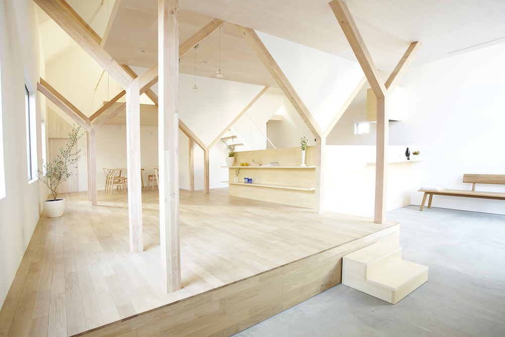
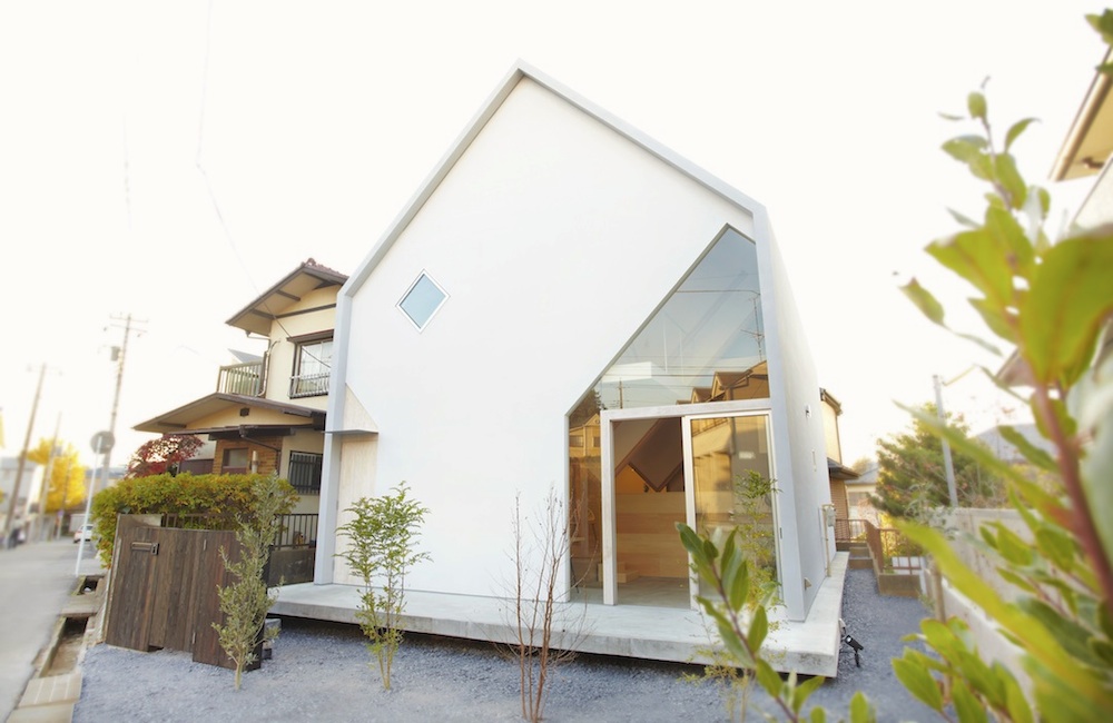
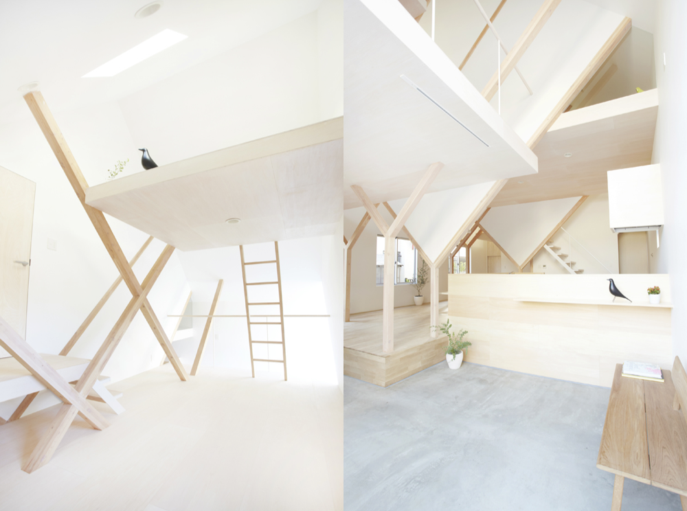
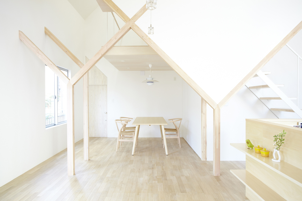
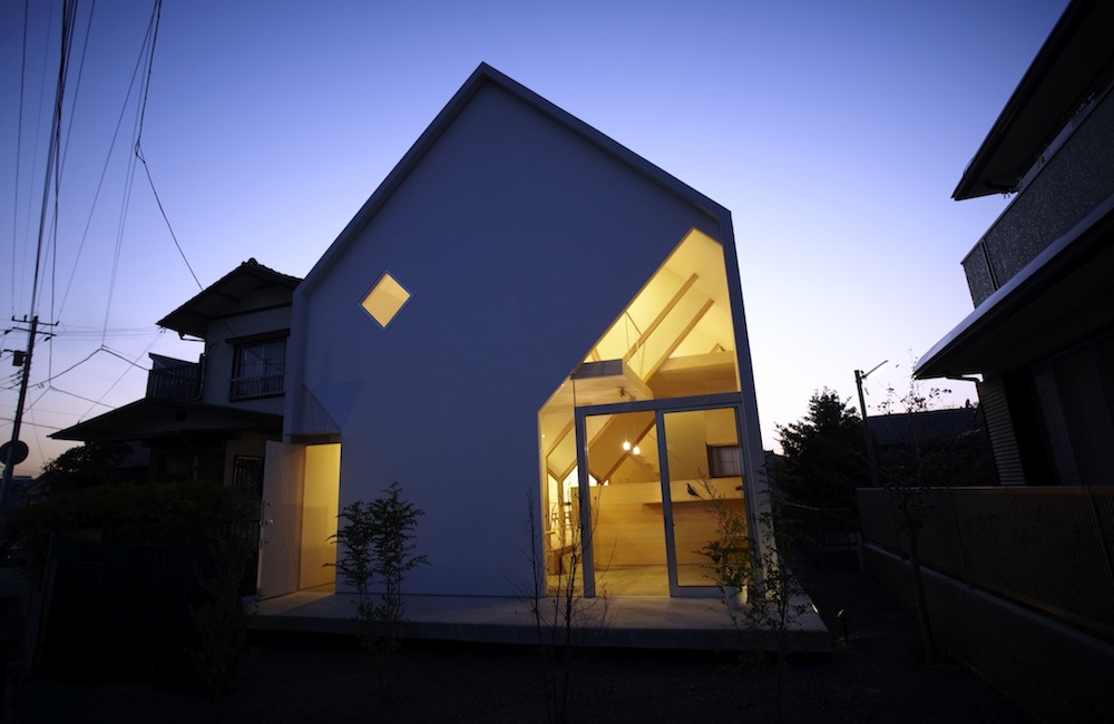
HSA are a Japanese architecture group who seem to have recently taken to naming their projects after letters of the alphabet. House H as pictured here was commissioned by a young couple with a small child and was built within a suburb of Tokyo known as Matsudo which is predominantly made up of houses built in the 60s. House H demonstrates many of Hiroyuki Shinozaki Architect’s idiosyncrasies including an absenteeism of interior walls and their fondness for multi-levelled, exclusively ladder-accessible spaces as also seen in House T.
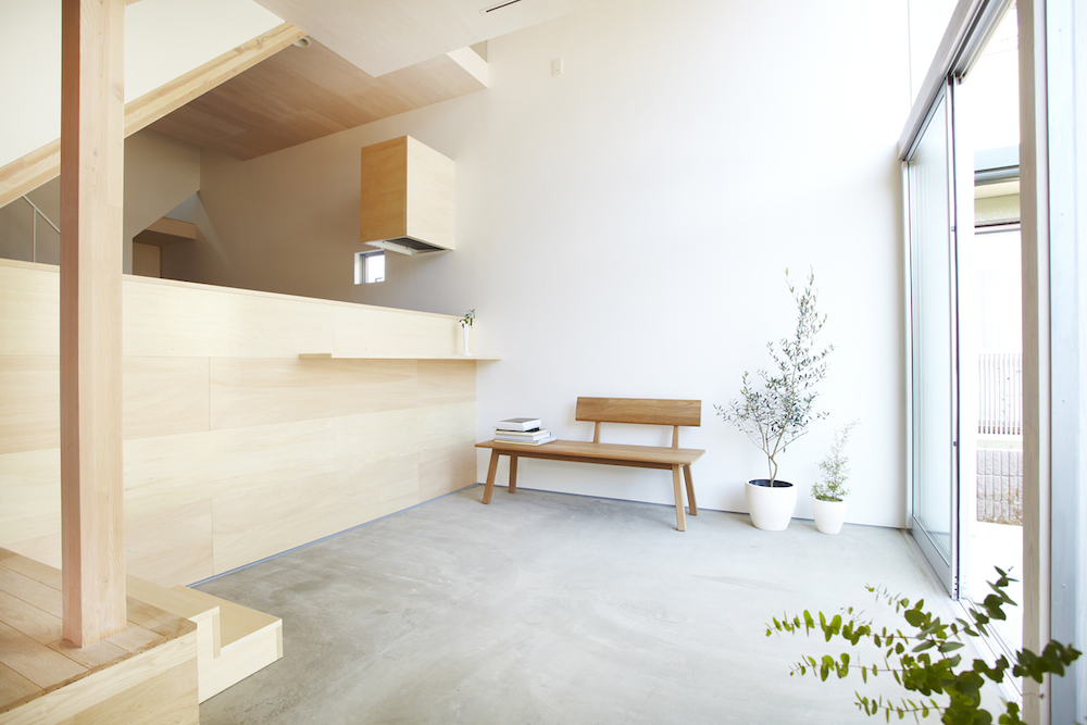
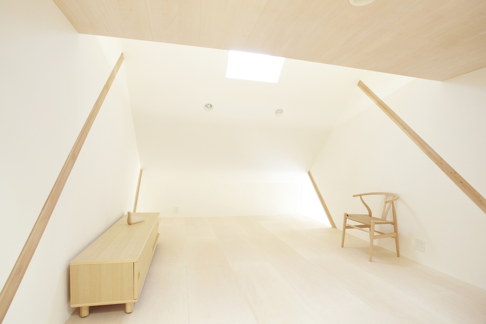
Light wood tones similar to those of beech and maple have been used extensively throughout the interior design of House H and coupled with the ultra-clean white plastered walls make this quite possibly one of the most spacious and airy houses I’ve ever seen.
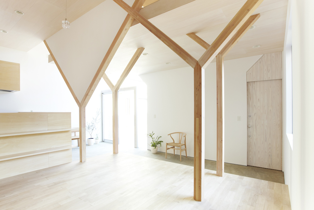
The architect in fact used linden plywood for the ceilings, upstairs floors, front door and kitchen counter along with light oak for the floor of the raised downstairs section and the Y-shaped beams. A pleasant detail is the way in which some of the arms of the Y-shape beams have been infilled with plaster while others are left hollow which helps to build the element of controlled chaos present within House H.
Plywood is becoming an increasingly popular material in minimalist interior design where it is often left unfinished to emphasise the stripped back aesthetic. However in House H, it has been masterfully fitted and couldn’t look more perfect. The subfloor which is exposed on the very lowest level to the rear of the house is polished concrete which is also inherently minimalist in style.
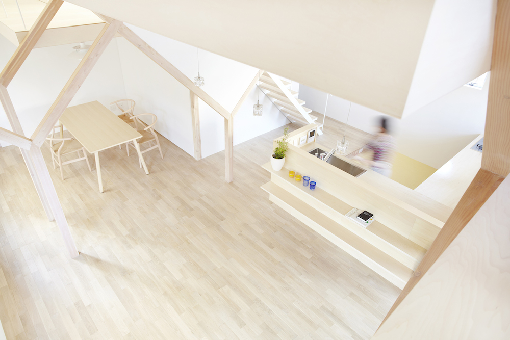
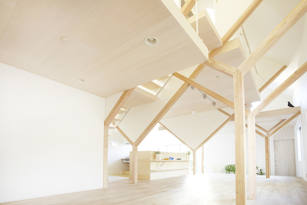
Eight Y-shaped frames support the various upper levels within this house with arms that meet to form crosses within the mezzanine level. From here access to the loft platforms above are offered albeit it exclusively by ladders. These multiple levels and open spaces are what really make House H special, but styling aside I can’t help but feel that the decision to have so many open edges with minimal protective barriers was somewhat irresponsible of the architect considering House H was designed for a couple and their young child who appears to be around the age of three.
Share this Post


Comments
They really dropped the ball when it came to naming this house. It obviously should be called ‘House Y’.